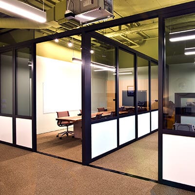
 PARTITION WALLS
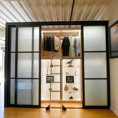 CLOSET DOORS
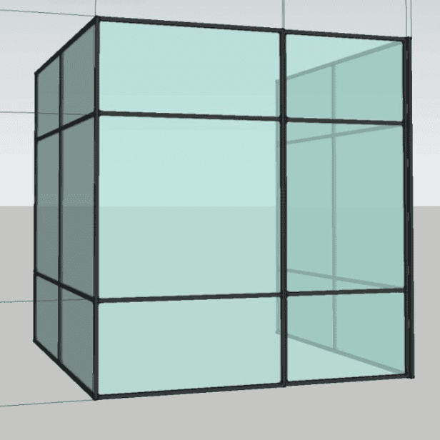
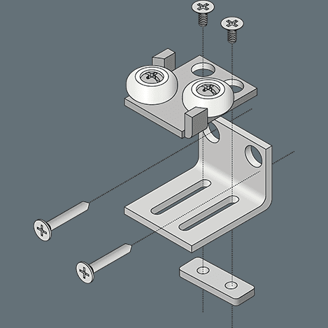
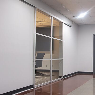 WALL SLIDE DOORS
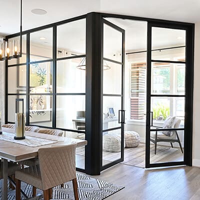 SWING DOORS
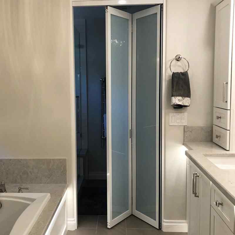 BI-FOLD DOORS
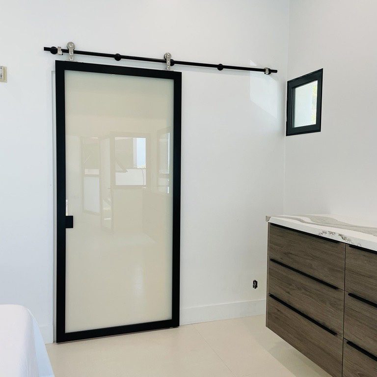 BARN DOORS
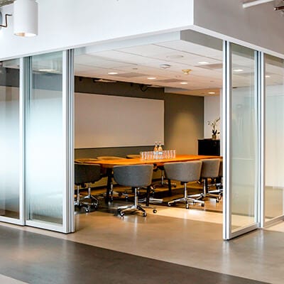 SUSPENDED DOORS
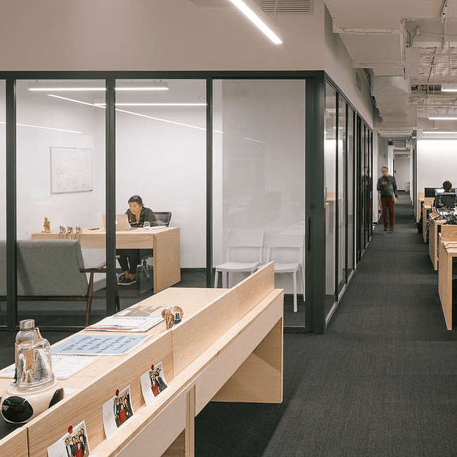
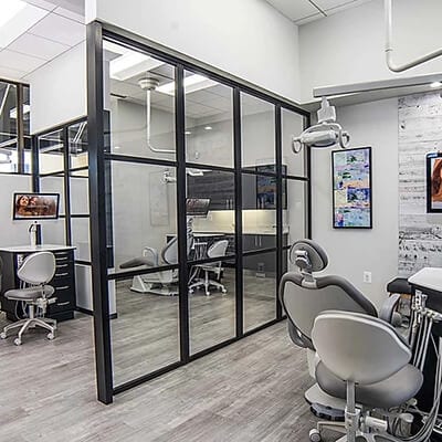
 HOSPITALITY
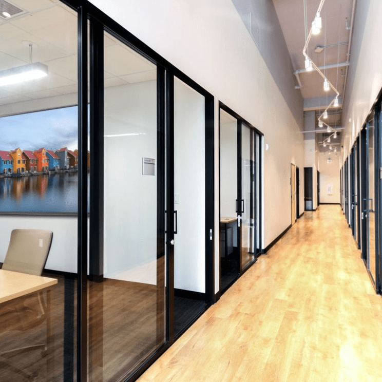 CO-WORKING
 HEALTHCARE
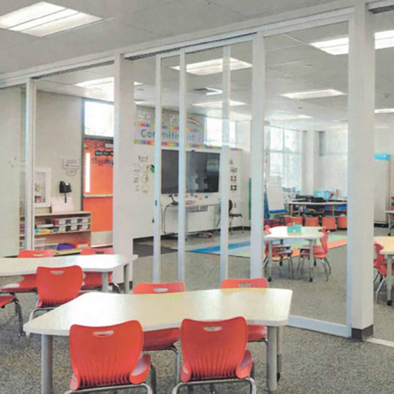 EDUCATION
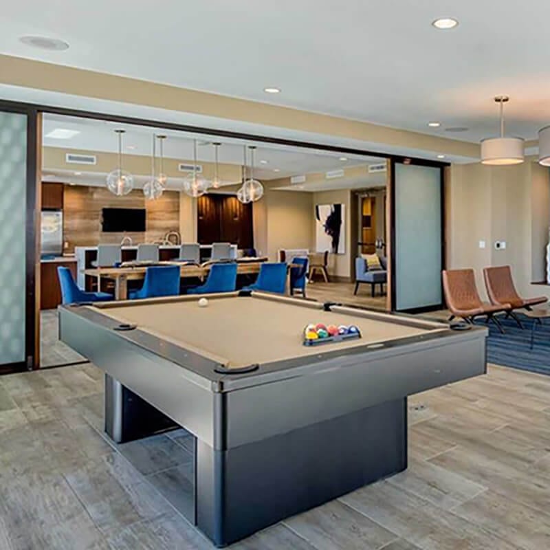 MULTI-FAMILY
 BECOME A TRADE PARTNER
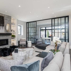
 PARTITION WALLS
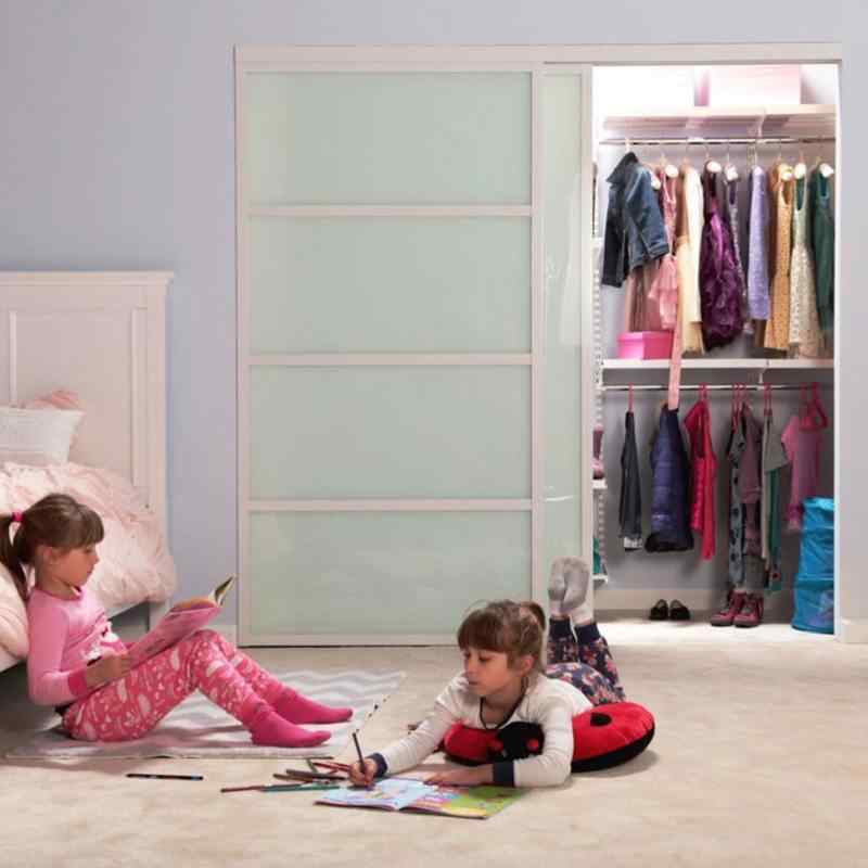 CLOSET DOORS
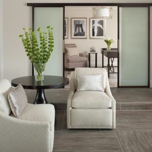 WALL SLIDE DOORS
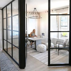 SWING DOORS
 BI-FOLD DOORS
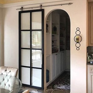 BARN DOORS
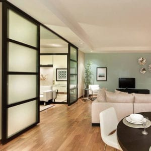 SUSPENDED DOORS
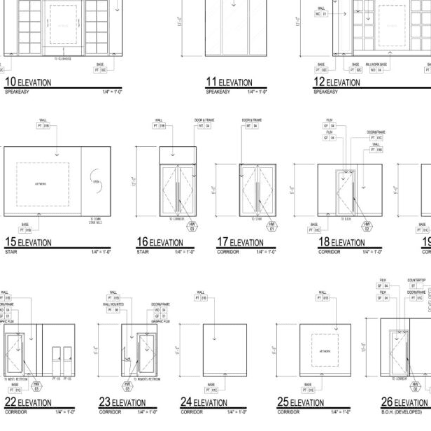

 10 REASONS
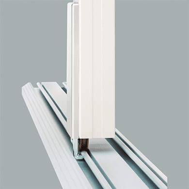 OUR PATENTS
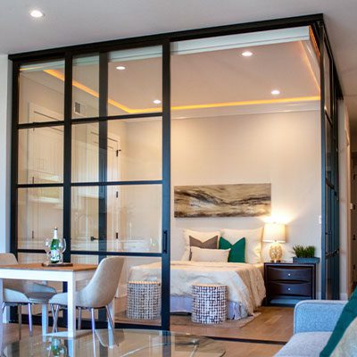 OUR PROCESS
 OUR WARRANTY
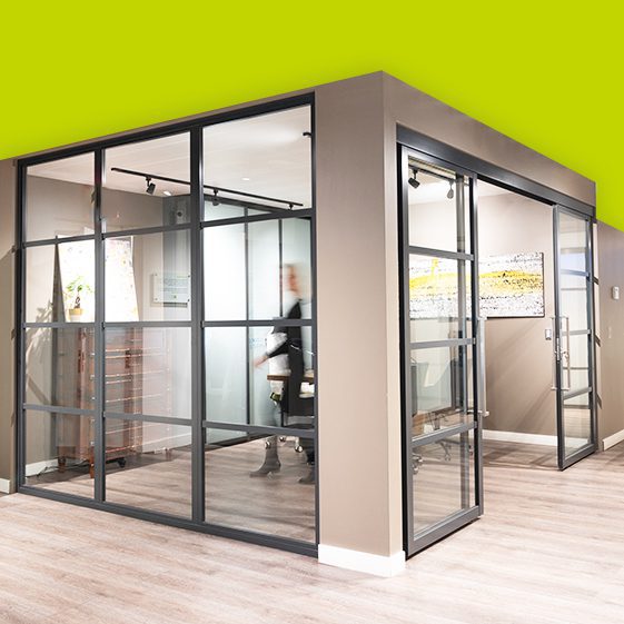 WHO WE ARE
 CAREERS
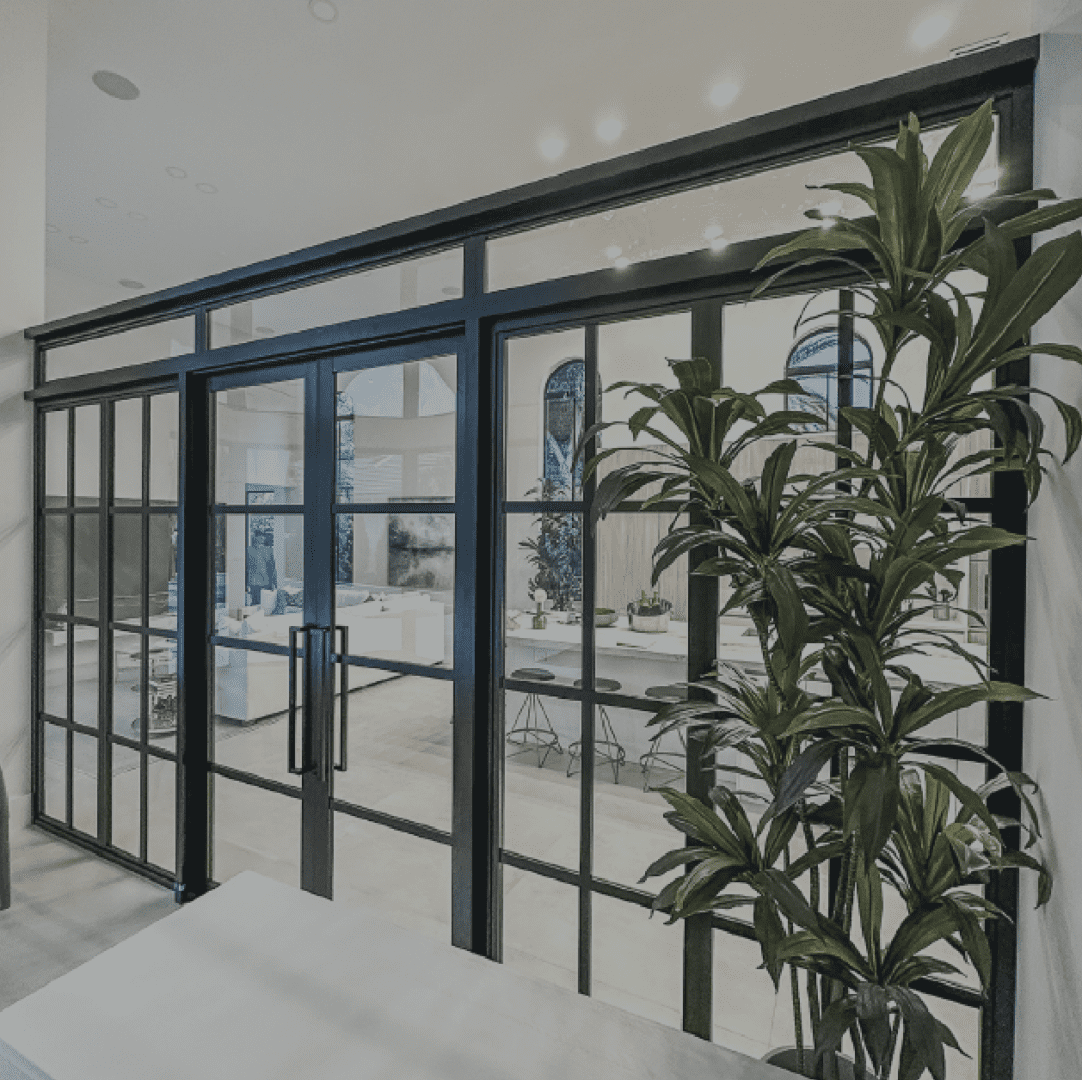 SUSTAINABILITY CULTURE
 BLOG
BLOG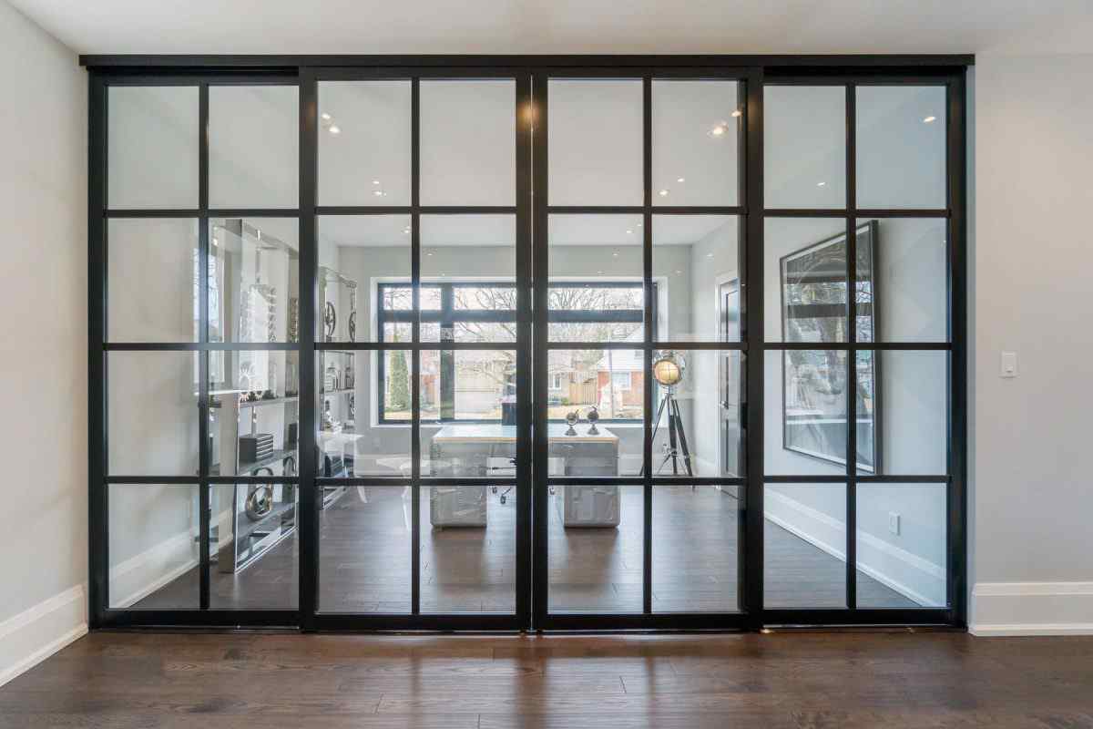
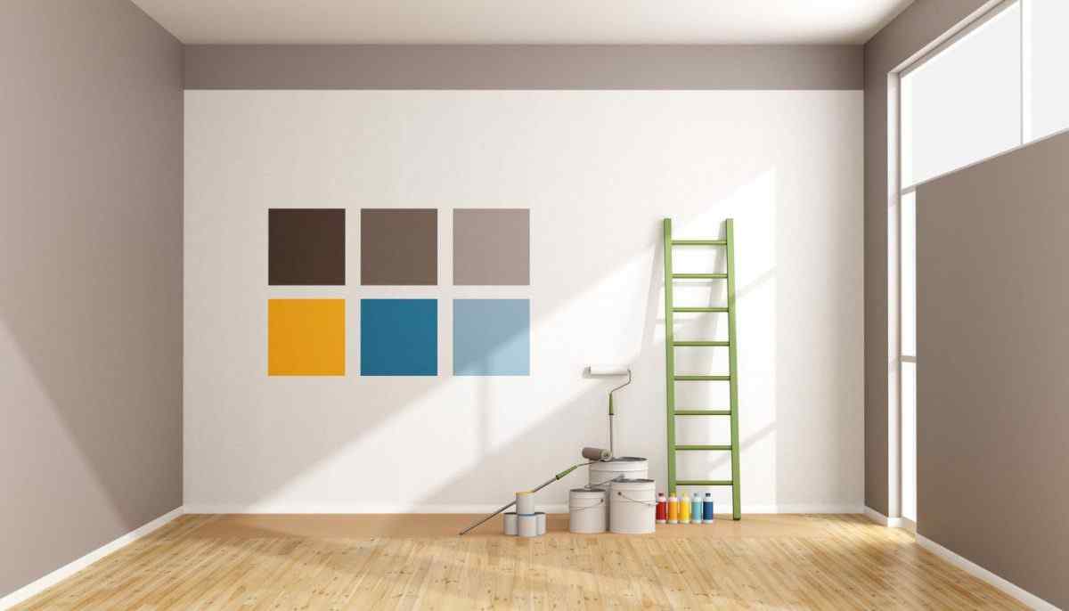
The Future of Color
Every year, interior designers and home fashion experts predict the future of color and inform the rest of us which shades and hues will dominate our lives over the next 12 months. It can tough to sort through all the contradictory prophecies, but it’s well worth your while if you want to stay up on the latest trends in interior design.
Now color forecasters have announced their picks for 2018, and the results are exciting. Neutrals continue to dominate many color palettes, although warmth and color have returned with a vengeance. So, which colors are in and which are out?
Grays
Neutral grays have enjoyed widespread popularity for years, and they continue to impress homeowners and decorators. While no longer on the cutting-edge, gray still makes for a wise color choice. Muted grays, in particular, communicate sincerity and gravity. Simple yet appealing, it acts as a backdrop against which you can place splashes of color and texture—accents that add drama and interest to an otherwise neutral room.
If you want to balance the hidden, understated quality of gray with a more positive color, then include white and black accent pieces throughout the room. Gray creates harmony by tying the extremes together while allowing the bold tones to stand out in stark relief. Gray also works well with pops of brighter color, like orange and yellow.
Finally, when designing your interior, don’t stop with the furniture pieces and artwork. Remember that your doors play a huge role in determining the look and feel of your room. That’s particularly true when it comes to closet doors, which often span the entire length of a wall.
Dark Grays and Blacks
2018 is all about moving outside your comfort zone. Instead of playing it safe, designers are ready to take risks. They’ve moved from praising lighter, more understated grays to embracing bolder, darker grays, charcoals, and even out-and-out blacks. Although some designers disagree, arguing that black has had its moment, it’s clear that the hue isn’t going anywhere soon.
Take PPG Paints, which has already named Black Flame its color of the year. Other paint companies have followed suit, selecting their most stunning shade of black as the trendy pick for 2018. In other words, black may be the new orange, and homeowners should take note.
Why do tastemakers and trendsetters lean toward the darker side of the spectrum? Color psychology experts have a theory. In a distraction-heavy, information-saturated world, black cancels out the noise and ushers in much-needed silence. Charcoals and other darker neutrals also imbue a room with a sense of strength and security—a welcome feeling in uncertain times.
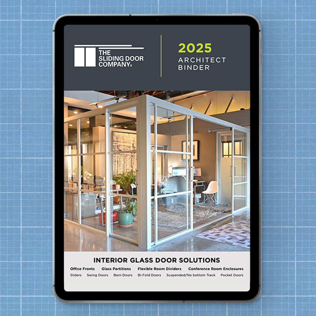
Want to add a touch of black without dousing the room in darkness? Go for black accent pieces instead of painting entire walls in the color. Also, think beyond bold trims and small furniture pieces. Consider barn doors and room dividers made of black aluminum frames and opaque black glass. The black gives you sophistication, strength, and boldness; the sliding door gives you openness and modernity—an impressive mix.
Neutral Metallics
This year, we have a new addition to the list of favorites: neutral metallics. Combining the simplicity of a neutral palette with the shiny pizazz of metallic paint, these hues stand out in nearly any room. Pair your metallic colors with intricate patterns and rich décor to convey edgy glamor.
Want to capture an air of contemporary elegance? Couple shiny accent pieces (gold chandeliers, gunmetal end tables, black trim) with Continental style room dividers to get a look that balances the exotic with the graceful. The takeaway? If metallic is destined to be the new neutral, and boho chic is destined to be the new minimalist, then neutral metallics are a designer’s dream, bridging both worlds in a stunning display of style and sophistication.
Warm, Earthy Tones
Neutral, earthy tones have been fashionable for years now, but this year marks a sea change toward the warmer side of the spectrum. That means you may see a lot of dark woods and chocolate browns this coming year. Camel has also emerged as a favorite accent color. Neutral yet rich, understated yet interesting, this earthy tone has broad appeal and boasts great versatility.
If warm and bold isn’t your thing, trend-watchers bring good tidings. Hazy pinks and other soft, sandy hues also stand out as top picks for the coming year.
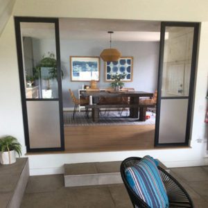
Blues
Blues never disappear entirely from the list of cool, sought-after colors. Translation: You can’t go wrong with a splash of blue, which calms the mind, soothes the soul, and elevates the room to a new level of sophistication. Not only that, but Zillow’s Paint Colors Analysis reveals that you can raise the value of your home by thousands of dollars just by painting the bathroom and kitchen blue.
What shade of blue has the greatest impact? That depends on your preferences. Right now, spruce blue tops Behr’s list of “it” colors. This greenish-blue sets off a wide range of styles and makes for a perfect trim. It also works well as a kitchen color, bringing freshness and vitality to the room. Powder blue and periwinkle are perhaps the safest bet when it comes to increasing the value of your home.
Whether you opt for a blue bathroom, a blue kitchen, or both, this sophisticated color works well with a modern design aesthetic. Think frosted glass barn doors, which pick up and reflect the cool tones, creating an ambiance of relaxed refinement.
Bright, Lively Colors
Vibrant and playful are also making a comeback. Designers have begun to break out from the safe enclave of neutral colors and make their first forays into a brave new world of energetic colors. From bright yellow and lime popsicle to blue and orange, bright shades of color have once again returned to grace homes around the country.
If you don’t mind pushing the envelope, go ahead and clash those colors. Mix patterns, textures, colors, and styles for an eclectic look that leaves the neutral minimalism of the past few years in the dust. Whether you mix metallics and pastels or soft, abstract lines and edgy geometric patterns, there’s sure to be a way to mix and match that suits your own sense of flair and style. To balance the quirkiness, you might want to install a set of classically beautiful sliding interior doors in traditional frosted glass. The combination of panache and stateliness creates an interesting, yet tasteful tableau.
What Color Is Right for You?
Need help coming up with a color scheme that’s both trendy and personal? Want to know what type of sliding doors complement your color scheme? Call The Sliding Door Company for a FREE consultation with one of our experts or simply walk into one of our 27 showrooms scattered throughout the country, from Boston, MA to San Francisco, CA, and everywhere in between. Each showroom features its own unique personality and an exclusive lineup of high-quality, sliding doors in a wide range of styles.
Experience the slide. Call now to schedule a FREE showroom tour and one-on-one consultation with an interior design expert.
Sources